

Kalena Hirst Consulting
Brand Identity Design
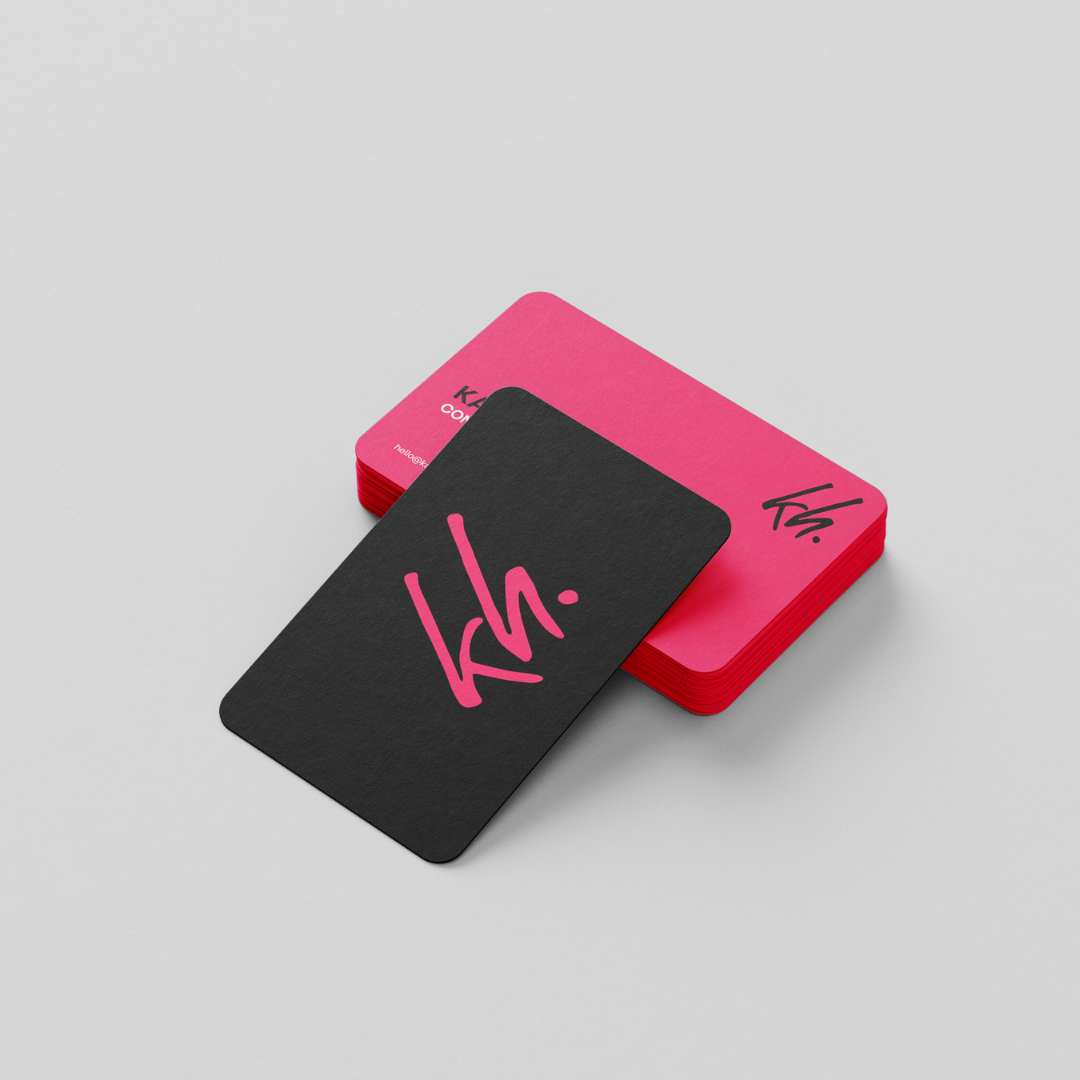
At Kalena Hirst Consulting, the mission is to empower leaders lift team engagement and boost capability with easy actionable steps. Embodying the essence of its founder, Kalena, the brand speaks volumes through its bold, commanding colors of cerise and black, mirroring her unwavering spirit—fierce, bold, and brimming with personality. The tagline, 'get shit done,' encapsulates the business ethos, and our branding reflects this dynamism flawlessly.
Drawing inspiration from Kalena's assertive nature, we crafted a brand identity that exudes strength and charisma. The color palette, dominated by the striking hues of cerise and black, emits confidence and authority. These colors not only grab attention but also symbolize the unyielding determination of Kalena and her consulting approach.
The logo is the face of the brand, featuring an organic, chunky hand-written script monogram. This distinctive typography embodies the human touch and personal connection that Kalena brings to her consultancy. Its bold strokes and fluid lines mirror the business's commitment to making a lasting impact on team engagement and productivity.
“ From only an initial discovery call and a client questionnaire Elise was able to drill down to exactly what makes me tick and what I wanted to achieve. She knocked the end result out of the park, and I’m beyond happy with my new branding.”


Check out this project!
Check out this project!


Wild Movement
Wild Movement aims to engage and inspire young, aspiring athletes. Our task was to craft a bold and stylish brand that resonated with Gen Z's fitness-driven, sporty souls.