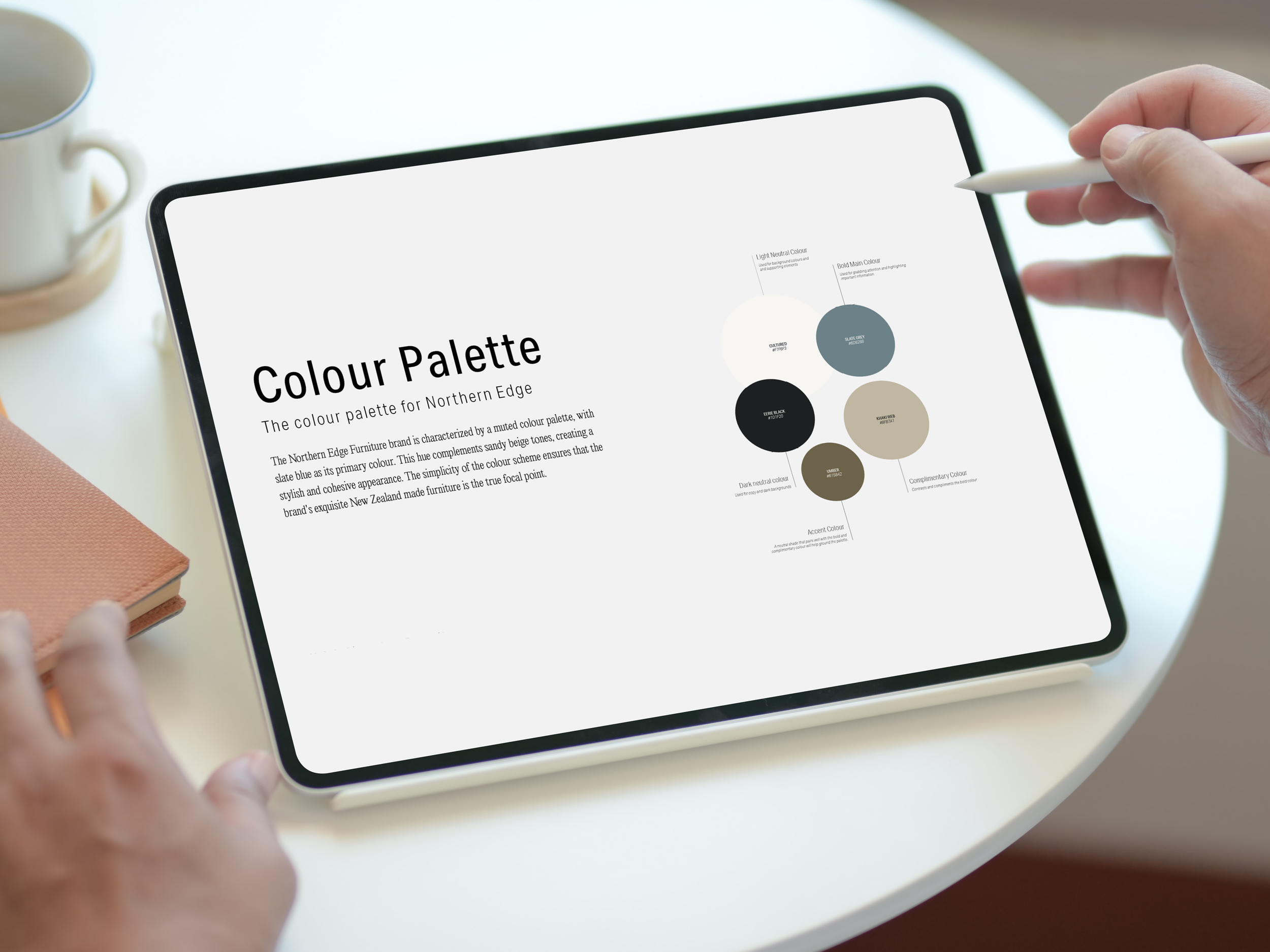
Does your brands colour palette pass this test?
Here’s a truth bomb most business owners and even some designers don’t realise: your colour palette can make or break how people experience your brand online.
I was reminded of this recently while working with a client. Her palette looked beautiful but I could tell straight away it wasn’t accessible. When I ran a quick contrast test, it failed. That tiny detail had the power to impact her brand’s readability, accessibility, and even the way her website performs in search results.
Your colours probably look beautiful together but If your colours don’t have enough contrast, your content becomes hard to read and less accessible. Google doesn’t directly rank you on colours but it can still hurt your website’s performance in search. Let me explain…
1. Is your brand’s colour palette readable?
Your colour palette plays a huge role in how easy your brand is to engage with. If there isn’t enough contrast between text and background, your message can get lost.
Think about how people experience your brand:
Skimming your website quickly on their phone
Reading content in bright sunlight
Scanning social media posts while multitasking
High contrast ensures your message is instantly clear, making your content more effective and easier for people to consume.
2. Is your brand’s colour palette accessible to everyone?
A colour palette with good contrast makes your brand inclusive. Around 300 million people worldwide live with some form of colour blindness, and many more experience visual impairments.
The Web Content Accessibility Guidelines (WCAG) set clear standards for colour contrast:
Small text: Minimum contrast ratio of 4.5:1
Large text: Minimum contrast ratio of 3:1
Meeting these standards ensures that your content is accessible to more people and creates a welcoming experience for everyone.
3. Does Google care about my colour palette? Will it affect my SEO?
Colour contrast itself is not a direct Google ranking factor. Google doesn’t scan your colour palette and boost your rankings just because your brand passes a contrast test.
But Google DOES care about user experience, which contrast impacts significantly. Poor readability and low accessibility can lead to:
Frustrated visitors who leave your site quickly
Users skipping over calls to action
Higher bounce rates and lower engagement
These are exactly the signals Google monitors when evaluating how valuable your website is to users. So, while colour contrast won’t directly boost your ranking, it indirectly supports the user experience that Google rewards. Better contrast → happier visitors → stronger SEO performance.
Check your brand’s colour palette passes the contrast test!
One thing I always do before handing over a brand is run the colour palette through a contrast checker.
It’s a small step that ensures your brand is readable, accessible, and ready to perform well online. Testing your colours is simple with free online contrast checkers, like Adobe Color
If your palette doesn’t pass, you can:
Darken or lighten one colour to create more contrast
Use a darker neutral for text while keeping your core brand colours elsewhere
Increase font size or weight for better legibility
Create a secondary “functional” palette specifically for text, buttons, and calls-to-action
Not sure how to make these adjustments while keeping your brand looking cohesive? That’s where I can help. I work with business owners and designers to refine colour palettes and ensure every element is both beautiful and functional. Get in touch!
Your brand colours are more powerful than you think. They shape how people experience your content, whether they feel included, and even how long they stay on your site.
By choosing colours with strong contrast, you’ll:
Make your content more readable
Create a more accessible brand experience
Support the user engagement that helps your site show up in search
If you’d like guidance on testing and refining your brand palette or creating a palette get in touch. I can help!


